At any given time, there are many different projects going on in most organizations — IT is implementing a new collaboration platform, while HR is implementing a new performance management process, while finance is rolling out a new time and expense system…
Each of us has limited change capacity — the level of attention, time, and energy we have available to personally adopt change — which itself is limited by all the other work that’s going on. When all of the competing projects are scheduled without consideration for the people that are impacted simultaneously, it pushes people over capacity and causes major burnout. We need a way to look across projects to see when and how people will be affected.

The tool for measuring and managing change capacity across projects is called a Change Heat Map. The Heat Map is a visual representation of how much different stakeholder groups are impacted by the change. Heat Maps have different levels of complexity and information, depending on how much detail you want to go into. I’ll go into three relatively simple Heat Maps here:
Simple Heat Map
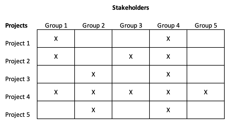
The simplest Change Heat Map shows the intersection of people and projects at a snapshot in time.
Start by listing all the different projects that are happening in the organization. Then list all the stakeholder groups that are involved in or affected by at least one of the projects. Mark an “X” for each of the stakeholder groups impacted by each of the projects.

Of course, your organization’s projects and people’s participation in them changes over time. In the chart above, it looks like Group 4 may be overwhelmed by the number of projects they are involved in. But are they? The next type of Heat Map shows how the projects affect each stakeholder group over time.
Time-Based Heat Map
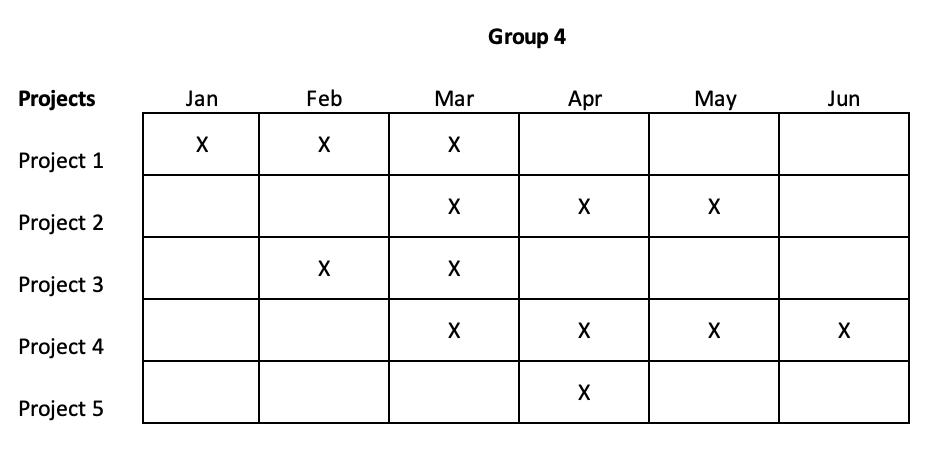
To show how each group is impacted over time, create a new map for each stakeholder group. Then, copy the project list to the new map, and create a timeline across the top (usually in weeks or months).
Next, mark an “X” for each timeframe the group is impacted by the individual projects.

The time-based Heat Map tells us that, as long as things stay on schedule, Group 4 will not be overwhelmed with all five projects at once. However, they may have some trouble getting everything done March, where four projects overlap.
To see their true capacity, we need to understand the level of impact for each project during March for Group 4.
Impact-Based Heat Map
How much change people can adopt at once depends on the level of attention, time, and energy required at any given time. For example, when we’re building awareness, the change does not take a lot of time and energy. When people are learning how to use a new system, it takes more. And if people need to get involved in the design and implementation, it may take even more.
There are many ways you can measure impact, for example:
- The amount of time it will take away from day-to-day activities
- The level of resistance expected
- The amount of disruption the change will cause
- How different the new way of working is from the current way.
Let’s group projects by low, medium, and high impact:
- Low impact: This may be a project that is a small change for this group, for a task they do that is not a big part of their job. Or, it may be a phase of a larger project that has minimal impact, such as building awareness, or taking surveys. Expect minimal resistance.
- Medium impact: A project with medium impact may be a small change that affects a regular part of someone’s job. Or, it may be a phase of a larger project that has moderate disruption to normal activities, such as learning. Expect some resistance.
- High impact: A project with high impact may fundamentally change the way work is done for this group. During the design and implementation phases of a large project, it will require much time and energy. Expect more disruption and resistance.
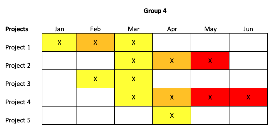
You can then color-code the levels of impact on the Heat Map over time for each stakeholder group. In the example below, red is high impact, orange is medium impact, and yellow is low impact. Keep in mind, the same project may have different impact levels for different groups. For example, a new payroll system may be high impact for Human Resources, medium impact for people managers, and low impact for everyone else.

As you can see in the chart above, March has a lot of projects, but they are all low impact. A bigger issue may be May, where there are two high impact projects being implemented at the same time.
Once you’ve identified time periods where capacity for change will be strained, you have three options:
- Change the schedule so all the change doesn’t happen at once.
- Add resources to accommodate the extra work and cognitive load.
- Expect a breakdown in performance and morale.
If people in your organization are feeling overwhelmed by everything that is going on, take the time to create a Change Heat Map to understand where capacity may be stretched. And if there are many projects on the horizon, complete the Heat Map in advance to best plan the implementations. Use the Heat Map to start conversations about the best use of resources during change.
How have you used Change Heat Maps to manage a portfolio of projects? Please share in the comments below.

 Interview: How Open Organizations Facilitate Change